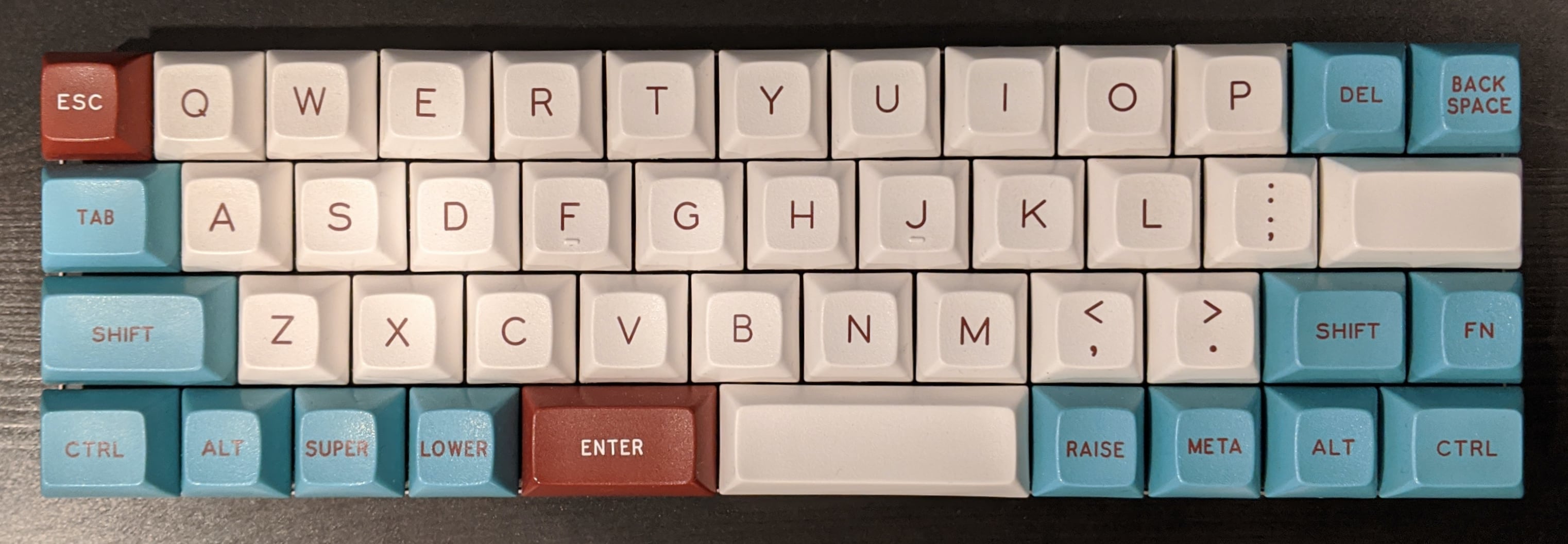
40% Keyboard Programming on Vortex Core
I recently started using a 40% keyboard (vortex core) as my daily driver for the $dayjob . It's a nice compact board, but the default layout isn't very efficient for programming, where common symbols used in development are tucked behind less-accessible key combinations.
I took some inspiration from the planck and another users reddit post. Another reddit user created a better MPC than the official version for remapping keys on the core, which was super handy for iterating and testing several layouts.
Some of my design decisions
- Enter on left space bar, as the home row is one key short of a 60 keyboard and missing the apostrophes was constantly tripping me up. Traditional enter key is now my apostrophe key.
- Swapped Fn1 and Fn physical keys. Red Fn1 is a little easier to hit for the common programming symbols layer. Blue Fn key layer is for navigation and media keys. I kept the mapping to the printed keys so they're a little easier to learn.
- Moved number row layer one key to the right. Default layout has the number home row starting on the Caps key, I pushed this to the 'a' key. Mentally I find having the number keys 1..0 under the home row default finger positions easier.

Limitations
- Macros are great for reducing the numerous shift-key operations from 3 to 2 key combos. There is a limit of 20 macros per layer, which my layout maxes out easily.
- Windows OS is required to use the MPC web interface the first time.
Custom Keycap set
I recently added a custom keycap set from primekb
